As introduced in Creating a Map of Science and Measuring the Role of AI in it, CSET’s Map of Science organizes clusters of scientific research publications derived from citation relationships. Each dot found on the Map represents a research cluster, and the location of RCs on the Map are based on cluster-to-cluster citation relationships. In effect, RCs with stronger citation links are closer together while RCs with few, or no, citation links are far apart. In this way, the Map of Science displays the structured landscape of science via direct citation links.
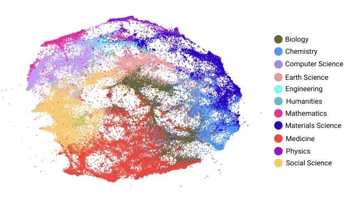
Because RCs are derived from citation links, as opposed to topic similarity, they are not automatically assigned a descriptive label that represents their subset of research. Therefore, we often describe RCs by their dominant research area, acknowledging that most RCs are cross-disciplinary. We can visualize this in the Map of Science by assigning RCs a color based on their dominant research area, as shown in Figure 1. This coloring helps describe individual RCs but also contextualizes all of science by visually representing the relationships between broad research areas. For example, we can see that computer science RCs overlap with research areas such as engineering, mathematics, and social science.
Figure 1. Map of Science by Broad Research Area

The range of available coloring schemes for RCs provides an analytic tool to explore different patterns and trends in scientific research, as the RCs maintain their location in the Map of Science.
While coloring RCs by their dominant research area is useful in many analyses, it is not the only way that we can characterize RCs and color the Map of Science. The range of available coloring schemes for RCs provides an analytic tool to explore different patterns and trends in scientific research, as the RCs maintain their location in the Map of Science. Similar to a map of a country that colors different states or regions by election results or population size, RCs in the Map of Science can be colored by analytically useful characteristics.
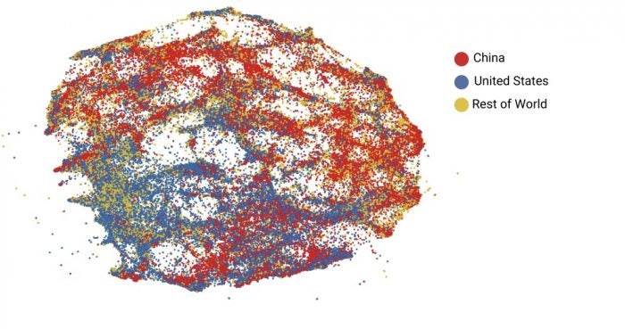
For example, we could characterize RCs by their dominant country and color the Map of Science accordingly. Measuring country dominance by number of publications makes for a useful coloring scheme for comparing the publication output of different countries, like the United States and China as shown in Figure 2. Using this approach, we see there is a higher concentration of U.S.-dominated RCs in the bottom half of the Map of Science (containing research in medicine and social science), and a higher concentration of China-dominated RCs in the top half of the Map of Science (containing engineering, materials science, and physics research). We explore using RCs and the Map of Science for cross-national comparison in more detail in the recently published CSET data brief, Comparing the United States’ and China’s Leading Roles in the Landscape of Science.
Figure 2. Map of Science by Dominant Country

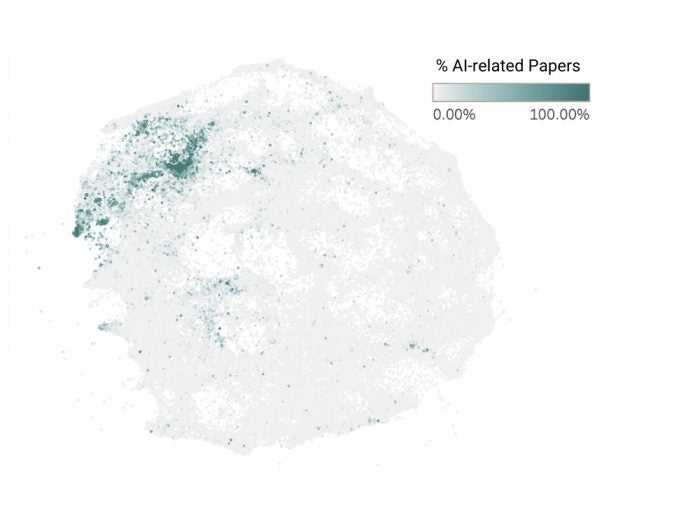
For another example, we can describe RCs using numerical fields, such as the percentage of AI-related papers in the RC, and color the Map of Science as shown in Figure 3. This coloring scheme provides a visual representation of the distribution of AI-related papers and can help identify where concentrations of AI-related papers are located within all of science. While the majority of RCs with high percentages of AI-related papers are located in the top left of the Map of Science, there are RCs with high percentages of AI-related papers throughout it, illustrating AI’s presence in various fields of science.
Figure 3. Map of Science by Percentage of AI-related Papers

By exploring different coloring schemes for RCs in the Map of Science, we see how different patterns and trends can be visualized for analyses and comparisons of scientific publications. In conclusion, as RCs are generated from citation links we label them in numerous ways using aggregated publication metadata.
